
How We Rank Industries: The Methodology Behind the ImGeld Heat Map
Industry momentum ranking combines fundamental and technical signals into a single composite score.

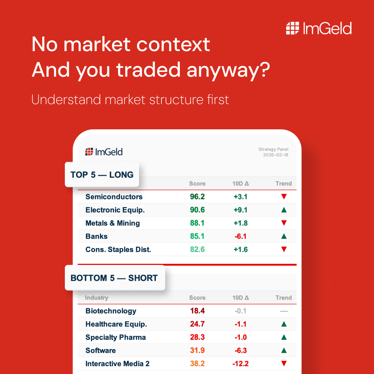
Most equity traders spend the majority of their time selecting stocks. They study earnings reports, price charts, and analyst commentary — then commit capital. What they often skip is the step that sits between market conditions and stock selection: industry momentum.
Research has consistently shown that a significant portion of a stock’s price behaviour is explained by the performance of its industry group. A strong stock in a weak industry faces a structural headwind. A mediocre stock in a leading industry may outperform simply because the tide is rising. The ImGeld framework is built around this logic, and the All US Industries Momentum Heat Map is its daily output.
This article explains precisely how that ranking is constructed.
Two Independent Signals, One Composite Score
The IMGScore — the ranking metric at the core of the Heat Map — is not based on price momentum alone, nor on analyst sentiment alone. It combines two independent data sources into a single normalised score between 0 and 100.
Signal One: Earnings Estimate Revisions (60% weight)
The first input measures the direction and intensity of earnings estimate revisions across the stocks within each industry. When analysts covering an industry collectively raise their earnings forecasts, it indicates that business conditions are improving — or that prior expectations were too conservative. When they lower them, the reverse applies.
This signal is forward-looking by nature. It does not react to yesterday’s price. It reflects what professional analysts, with direct access to company management, sector data, and macroeconomic models, believe about the near-term earnings trajectory of each industry’s constituents.
Each industry receives a rank relative to all others tracked in the system. That rank is then inverted and normalised to a 0–100 scale, so that the industry with the strongest upward revisions receives a score close to 100, and the weakest approaches 0.
Signal Two: Price Action Consensus (40% weight)
The second input captures the directional consensus derived from price-based technical indicators across the stocks within each industry. This is not a single indicator. It reflects the aggregated technical posture of the industry — whether price action is, broadly speaking, in a constructive or deteriorating state.
This signal is rescaled from its raw directional range to a 0–100 format, where a reading of 100 indicates full bullish consensus, 50 indicates neutrality, and 0 indicates full bearish consensus.
Combining the Signals: The IMGScore Formula
The two normalised inputs are combined using a fixed weighting:
IMGScore = (0.6 × Fundamental Signal) + (0.4 × Technical Signal)
The result is a composite score between 0 and 100, updated daily.
Interpretation follows three clear thresholds:
▪ Above 70 — structurally bullish conditions. The industry is receiving positive earnings revisions and supportive price action. Consistent with prioritising long setups within that group.
▪ Between 30 and 70 — neutral. No strong directional bias. Capital deployment requires greater selectivity and tighter risk parameters.
▪ Below 30 — structurally bearish. Estimate revisions are deteriorating and price action is weak. Consistent with prioritising short setups or reducing exposure.
Why the Weighting Favours Fundamentals
The 60/40 split is not arbitrary. Earnings estimate revisions have a demonstrated relationship with forward price performance over a 20–60 day horizon — the time frame the Heat Map is explicitly designed to serve. Price action matters, but it is a lagging confirmation. Fundamentals, when they shift in aggregate across an industry, tend to lead.
This weighting means the Heat Map will not simply reflect what the market has already done. It is designed to identify where conditions are improving before that improvement is fully priced in.
A Live Example: Media at Number One
In our current ranking, the Media industry holds the top position with an IMGScore of 77.83 — up from second place in the prior reading. The score is consistent with analysts revising earnings estimates upward for the industry’s major constituents, alongside supportive technical posture across the group.
The narrative around Media has been mixed for an extended period. Structural pressures in linear television, high content costs, and fragmented audiences are well documented. Yet the IMGScore reflects what the data is indicating now, not the story the market has been telling for the past three years. Those are different things.
Process over noise. Structure over narrative.
The All US Industries Momentum Heat Map is available to registered users, delivered daily as an Excel file. Registration is open.